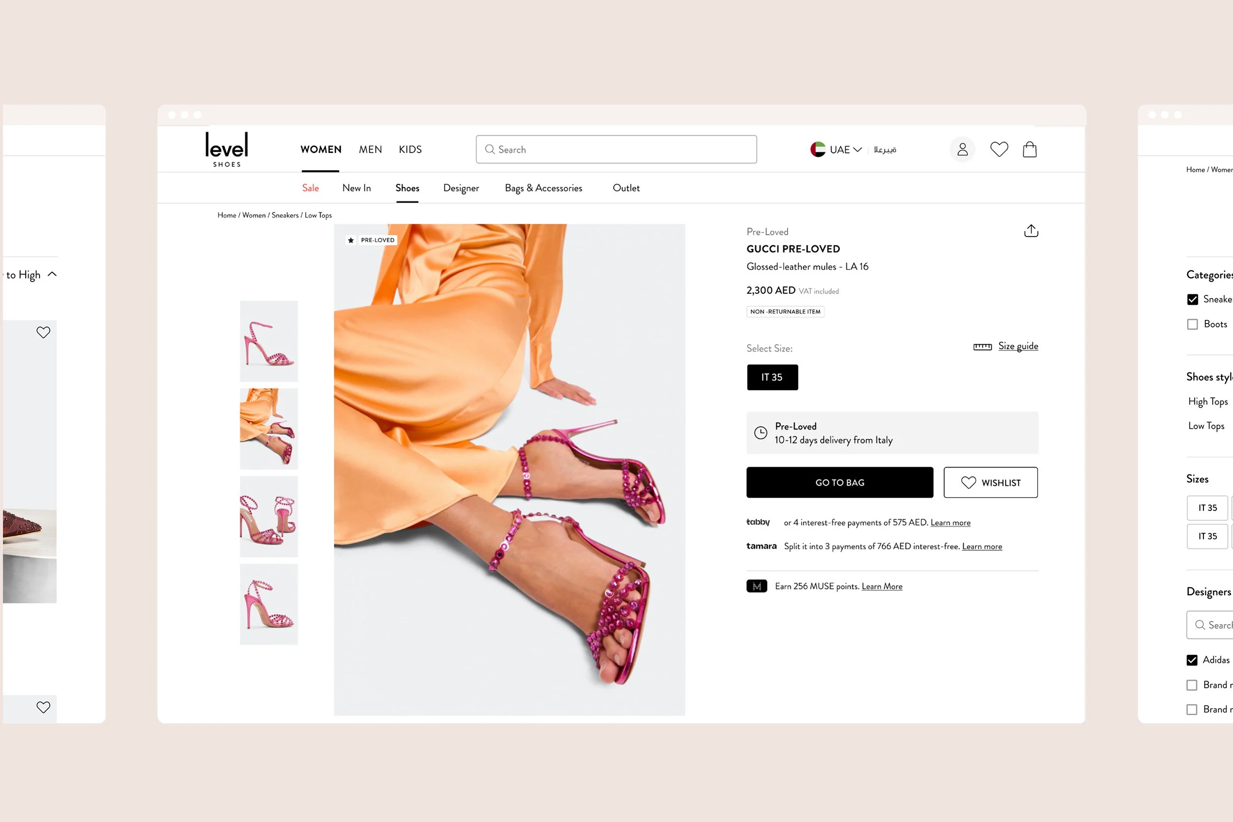
Level Shoes
Dubai
Level Shoes is the world’s largest store specializing in authentic footwear for women, men, and kids.
Upon joining the eCommerce team, I identified key usability issues that were negatively impacting mobile conversions.
This project focused on enhancing the mobile shopping experience through a structured UX design process.

Project goals
Launch the new Level Shoes app.
Improve user experience and retention by identifying and addressing user pain points.
Optimize solutions while considering development costs for new features.
My role
Research & analysis
User experience design
Collaboration with web developers, marketing, and upper management stakeholders
Research and analysis.
I started by analysing the Google Analytics data to see if there were any patterns or hidden nuggets to be found.
-
Developed and distributed a survey to our email database to gather insights into customer behavior and engagement.
-
Conducted interviews with six past customers who had made a purchase within the last three months to understand their experiences and pain points.
-
Analyzed industry competitors to evaluate how they addressed similar user experience challenges.
What are our customers saying about us?
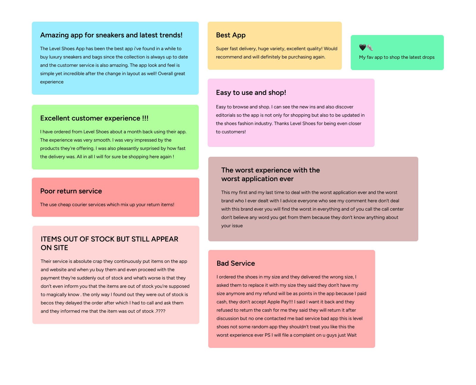
😊 Some happy and bad reviews 😤
Understanding User Needs
User Feedback & Reviews
By collecting and analyzing customer feedback, both positive and negative, I identified common themes that informed our design decisions.
User Feedback & Reviews
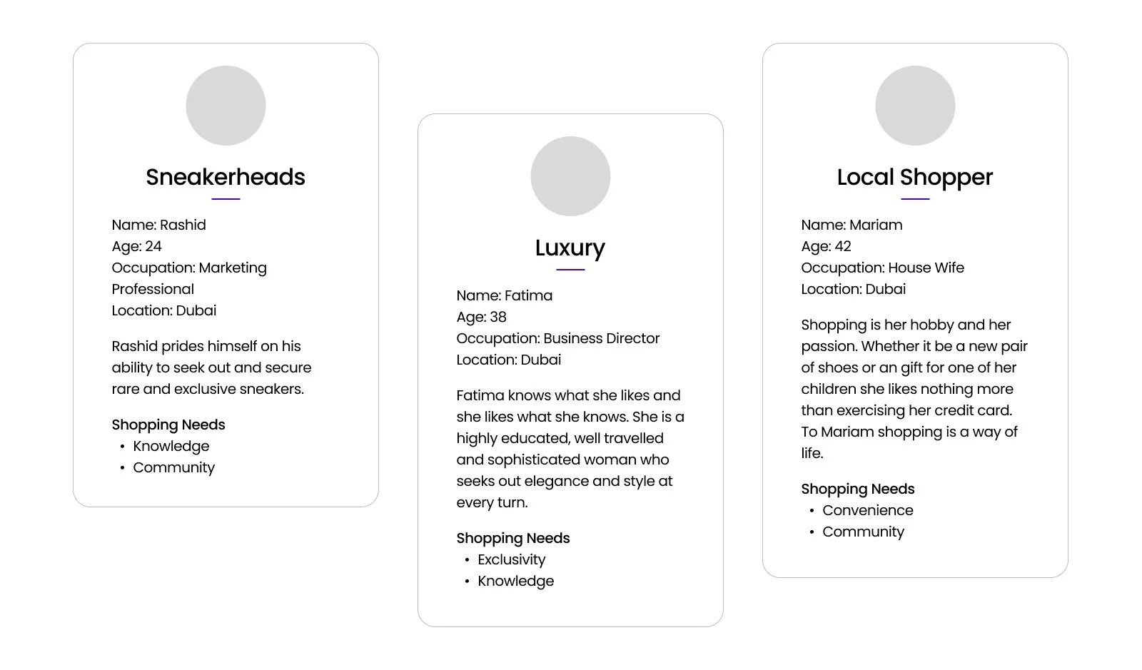
Creating a Persona
Based on user interviews, I developed a user persona to encapsulate key needs, pain points, and expectations throughout the shopping journey.
I wanted to understand what is important for the user at every step of the journey, and to evaluate the findability of products on the Level Shoes site.
Customer Journey Mapping
To build empathy and identify friction points, I created a customer journey map highlighting the key interactions and challenges users faced on the Level Shoes platform.
Problem Definition
Using affinity mapping in FigJam, I categorized user pain points and prioritized them based on their impact on user experience and business objectives.
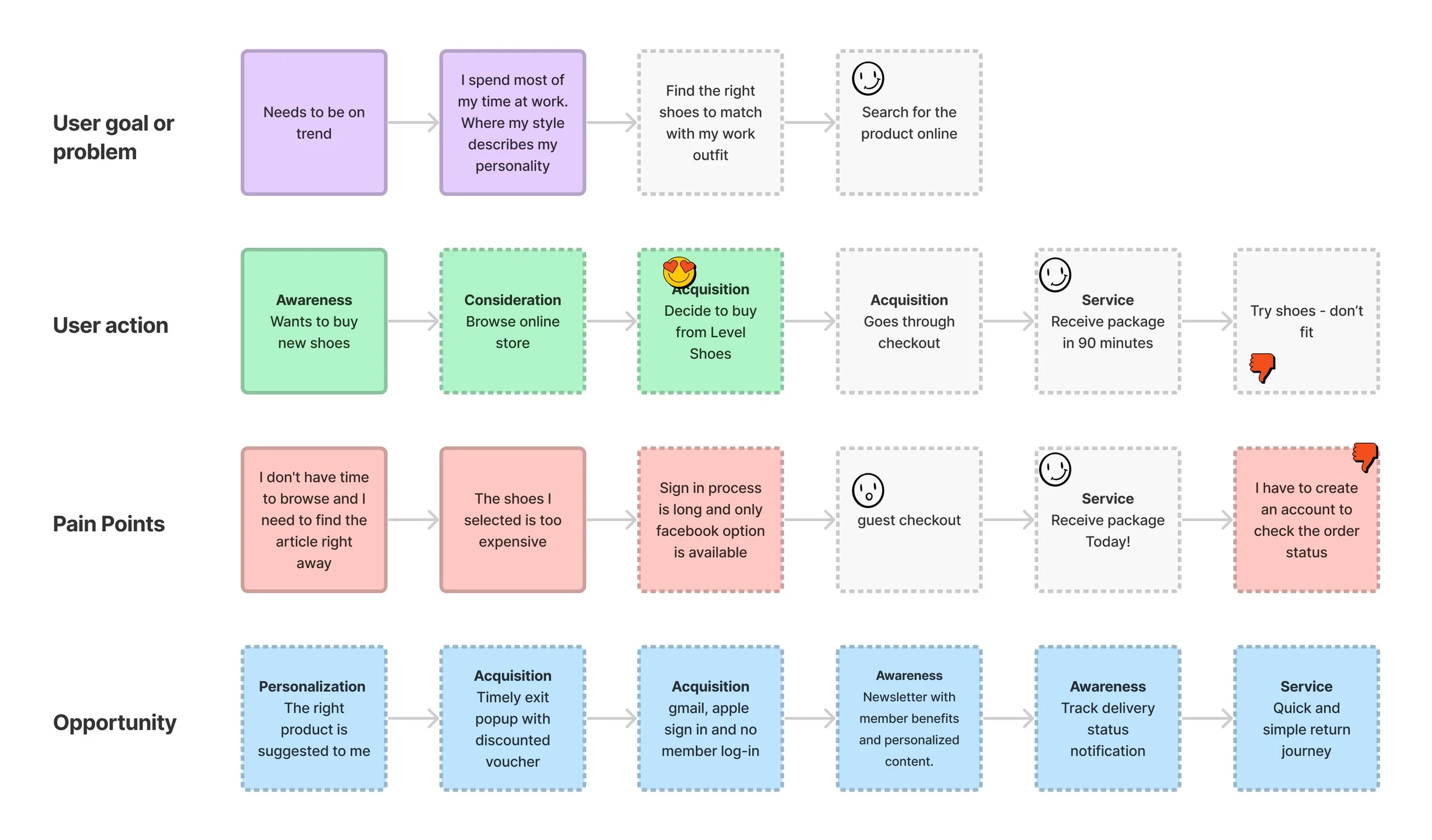
Key Issues identified:
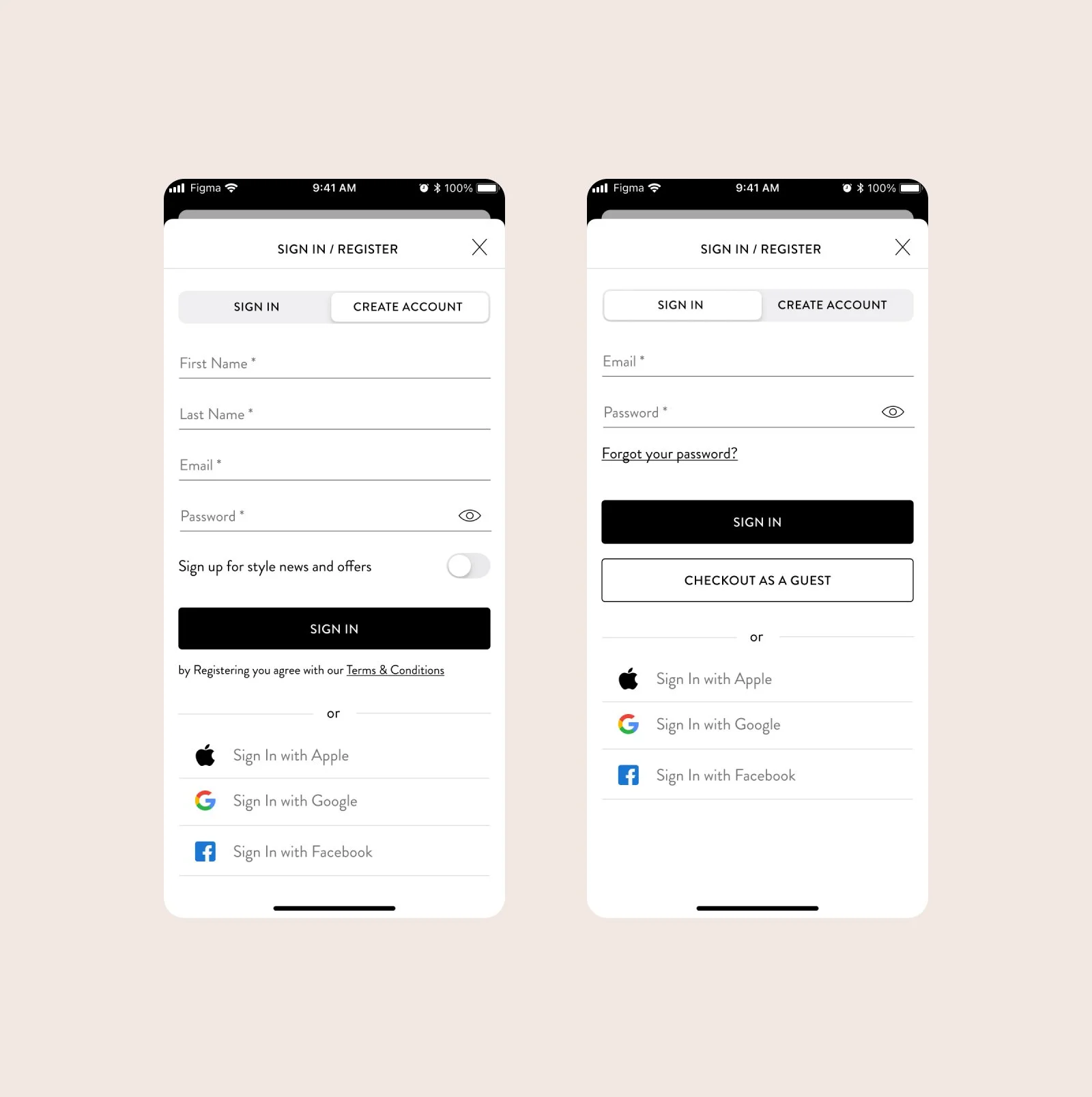
Lengthy sign-in process with only Facebook as an option.
Mandatory account creation to check order status.
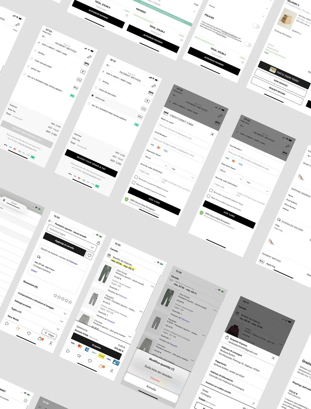
On the iOS app, the user needs to complete 7/8 steps before checking out.
Design & Development
Wireframing
Created wireframes based on research findings and business priorities, enabling rapid iteration before finalizing the interface.
Brand Identity & UI Improvements
Refined typography, sizing, alignment, and spacing to enhance usability.
Established a cohesive brand identity with a consistent color palette and visual elements for improved recognition.
User Testing
Conducted usability testing with five participants to evaluate the redesigned one-step checkout and sign-in process.
Used in-depth interviews to collect qualitative feedback and refine the design further.


Results & Impact
Enhanced Sign-In Process: Introduced social sign-in options, including Apple and additional networks.
Simplify the checkout by reducing the number of steps: The checkout process involves entering your shipping information, confirming your delivery schedule, and providing a payment method. We've consolidated all of these steps into one streamlined page, a bottom sheet that opens above your shopping bag, so you can always zoom out and review the products you're purchasing.
Higher Engagement & Retention:
Daily engagement increased by 20%.
Improved feature interaction and retention rates.
Users better understood the app’s value proposition and available features.
With the new version launched and monitored through analytics, user engagement and satisfaction significantly improved, validating the hypothesis that, In the past, usability issues hindered the user acquisition and purchasing process.